A designer always aims for excellence and perfection. They are basically a relevant source of expression to embark on necessary elements on new assignments. They define the nuances of design and showcase your skills at the same time. Thus, a basic intact is required for a Graphic design NZ professional.
To hit the opportunity with the right force and needful creativity, one must be thorough with the fundamentals of Graphic Design and SEO NZ and apply the same in the diverse range of projects. There is a frequent need to understand the basic design principles like social media graphics, web, and app UI, videos, banners, advertisements, or more. Some of the basic principles include the following:
- Balance
Balance the important aspects of life and hold equal credentials in terms of graphics. Nobody can deny the fact that balance lends stability and provides structure to the design. There is always a value to each of the elements present in the design like Shapes, text boxes, and images.
- Visual Hierarchy
Visual Hierarchy creates different graphic elements, as designs are arranged in order of importance of each component. This is an important factor to communicate to the viewer’s eyes. It helps them focus on the elements in the decided order. Visual hierarchy acts as a responsive framework and leads designers to think about distinctive aspects all at once.
- Alignment
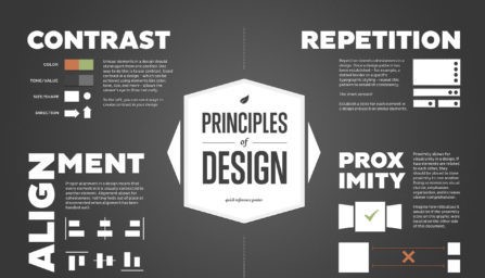
Alignment is another essential and important fundamental in graphic design NZ. It plays an important role and determines the designer to create a seamless visual connection with the elements in the design. It provides an order to follow with the appearance of the blocks, shapes, texts, and images. With this, you can create a determined flow to the overall design by ensuring the elements have a smooth amalgamation.
- Space
SEO NZ company might be aware of the process to fill in space with the creative design. The use of images, colors, and shapes paves the way for the beautiful photos to come to life. The remaining space is often called a “negative space”. A part of a design always leaves a specific blank space to balance it out with the ones that are filled in.
However, it provides the viewers with a smooth and clear sight of the elements. The negative space is also referred to as white space and helps you draw the attention of a viewer to a specific element of the design. It creates focus and further offers visual cues to items that belong together and those which are separate. Providing a relaxing and clean visual effect reinforces the quality of work and professionalism.
- Proximity
The list of basic principles of graphic design helps you adjoin the value of proximity. It creates a relationship between similar or related elements. Proximity helps in organizing the page by grouping similar items. This provides a clear picture of a design that does not need extra effort to be understood. It further provides a connection to the details to visually bind them all together.


